Meteorite Media Impact
A visualization comparing meteorites' physical mass with their online media impact across search and social platforms.
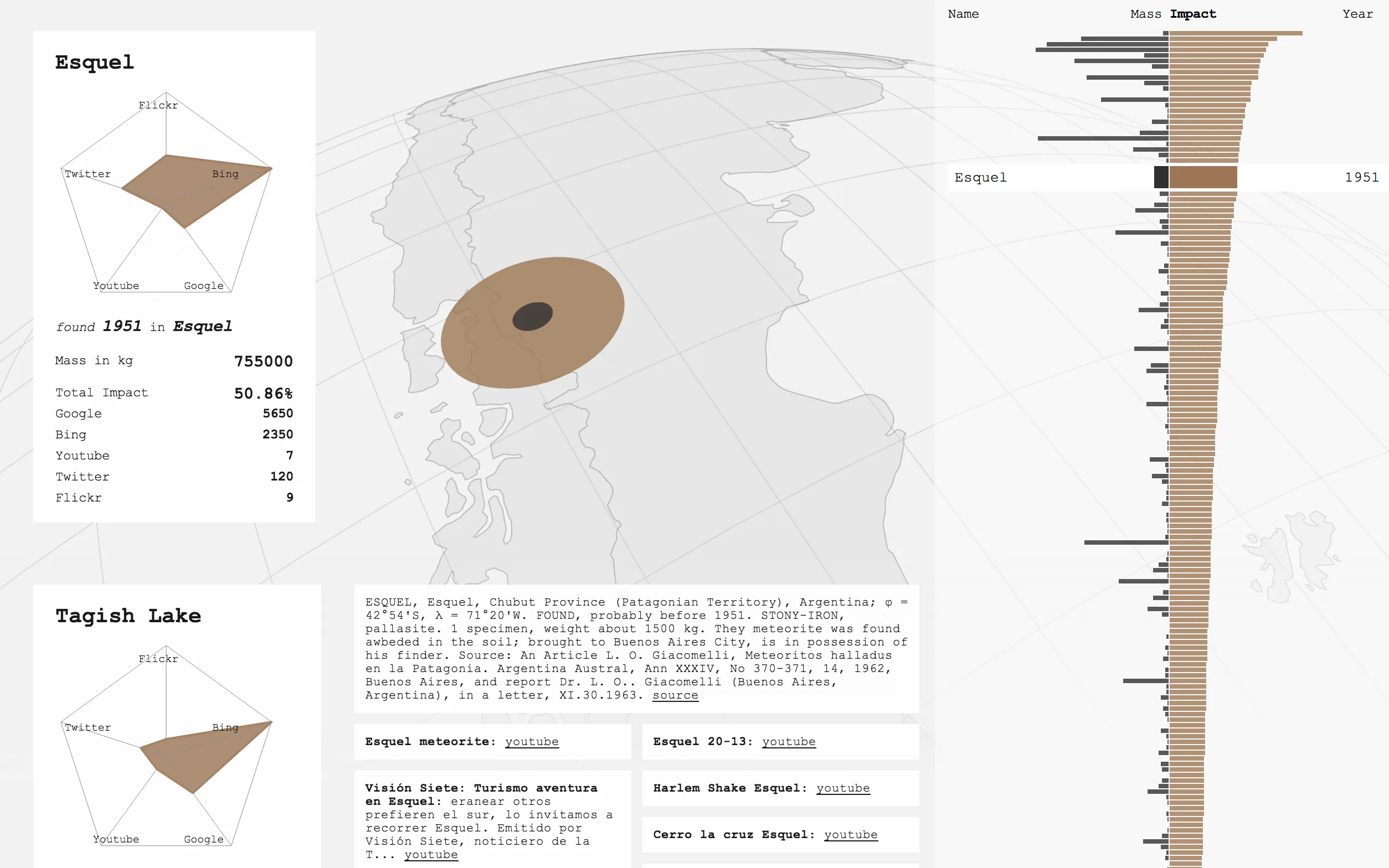
When a meteorite strikes, it leaves two craters: one in the ground and one on the internet. This visualization compares the physical mass of meteorites with their media impact on the web — how much attention each strike generated across Google, Bing, Twitter, Flickr, and YouTube.
The hard part was the data. To measure the virtual footprint of more than 30,000 meteorites, we searched for each one as “name meteorite” — other phrasings would have skewed the ranking — and crawled Topsy’s Otter API, the Twitter, Flickr, and YouTube APIs, and Google and Bing results using CasperJS, PhantomJS, and Node.js, then fused everything in a MongoDB into one comparable dataset.
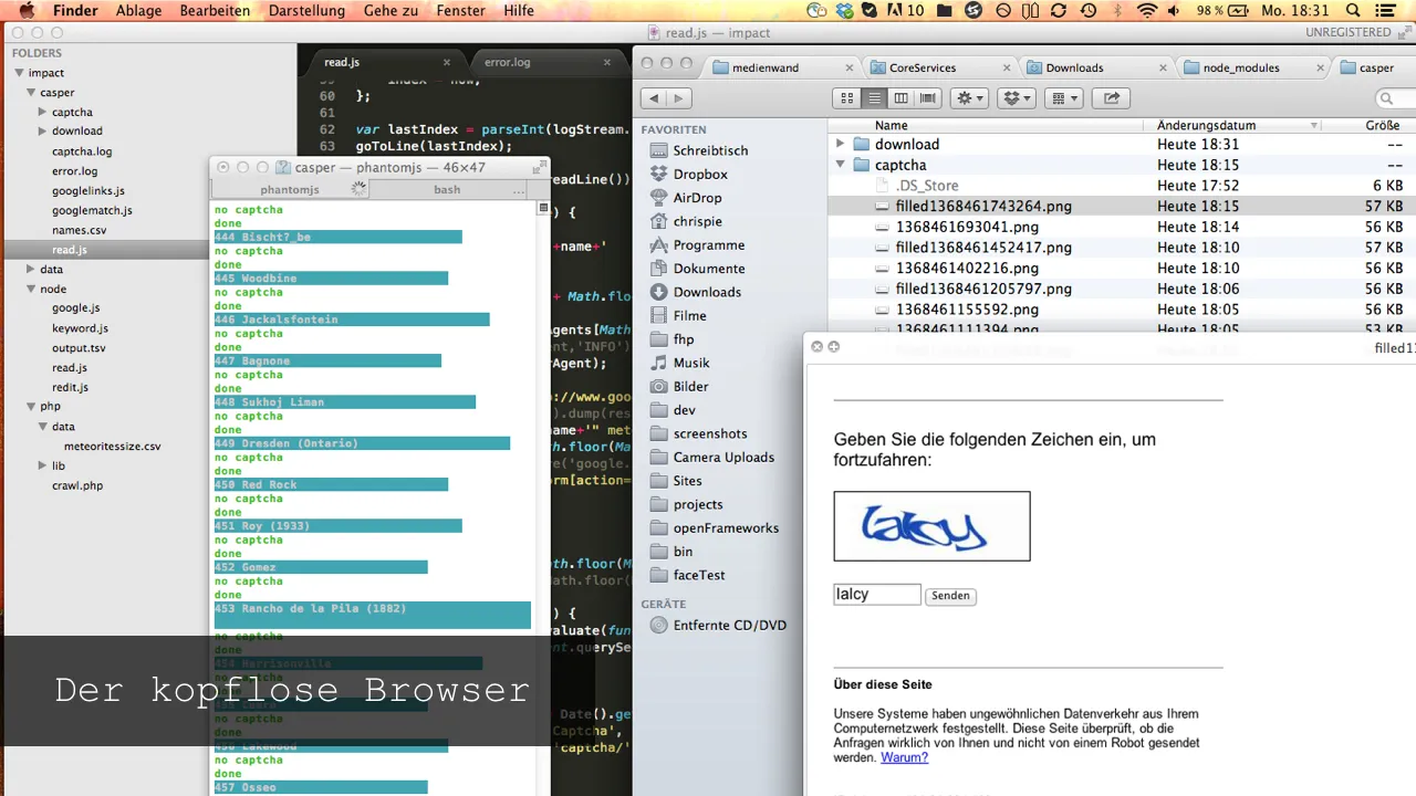
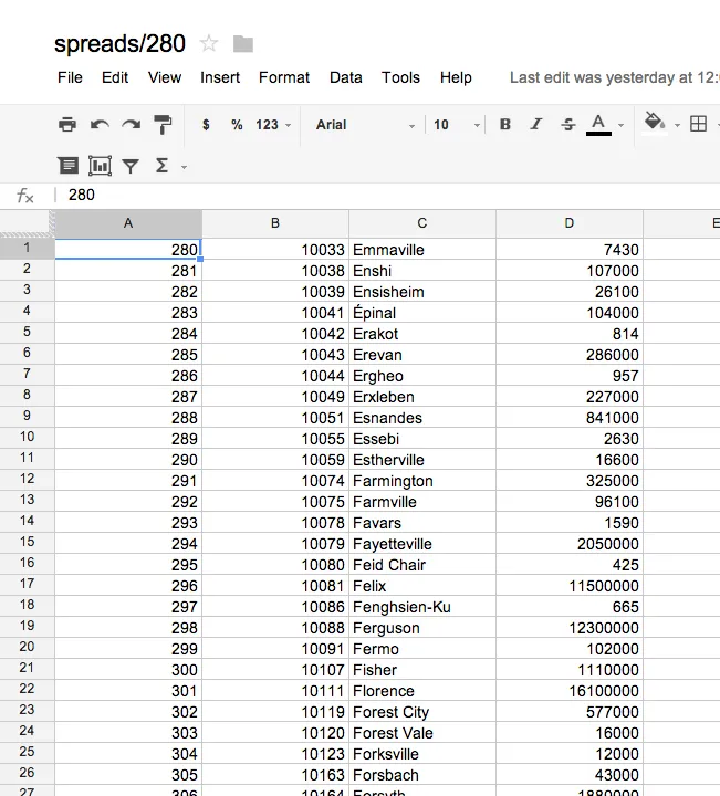
Google’s hit counts seemed the most telling, and Google was the hardest to get. Its search API would have cost nearly $150 for that many queries, so I scraped instead: a headless PhantomJS browser with a random window size and user agent typed each search, and whenever Google threw up a captcha page, a small Node.js script sent the screenshot to the DeathByCaptcha service and handed the solved word back. Later I stumbled on a captcha-free route through Google itself: Google Apps Script generated spreadsheets of 50 ImportXML queries each and saved the result pages straight from Google’s own servers. The whole saga, with screenshots, is written up in German on Incom.
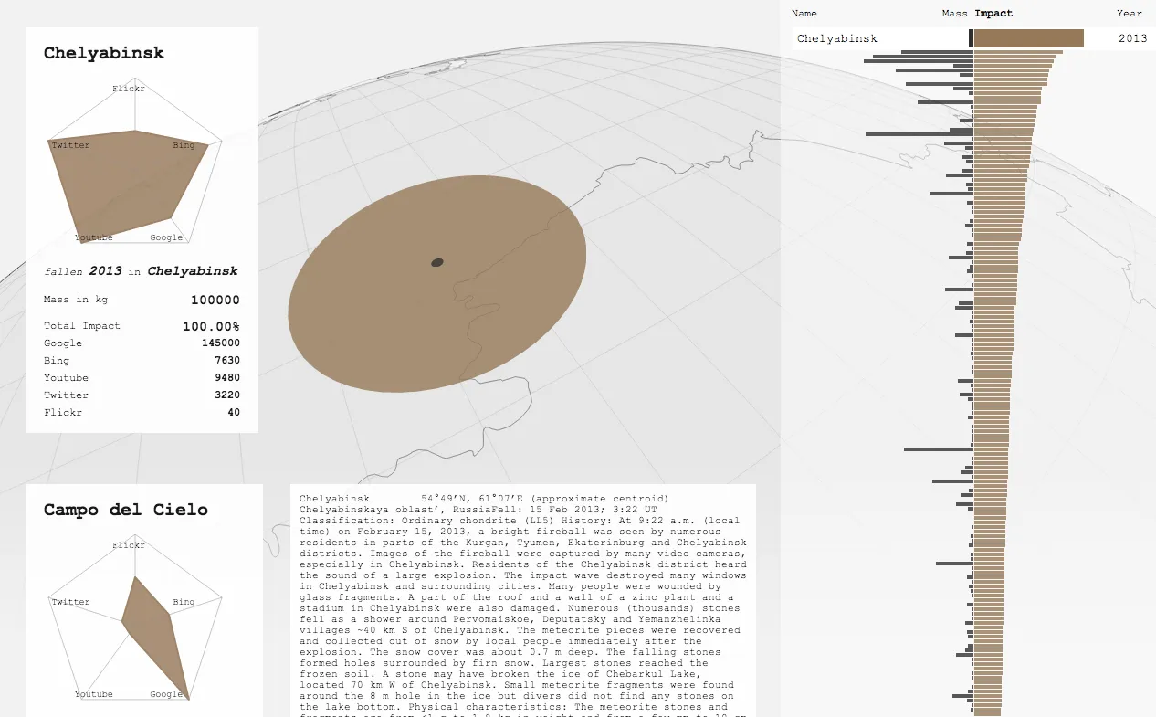
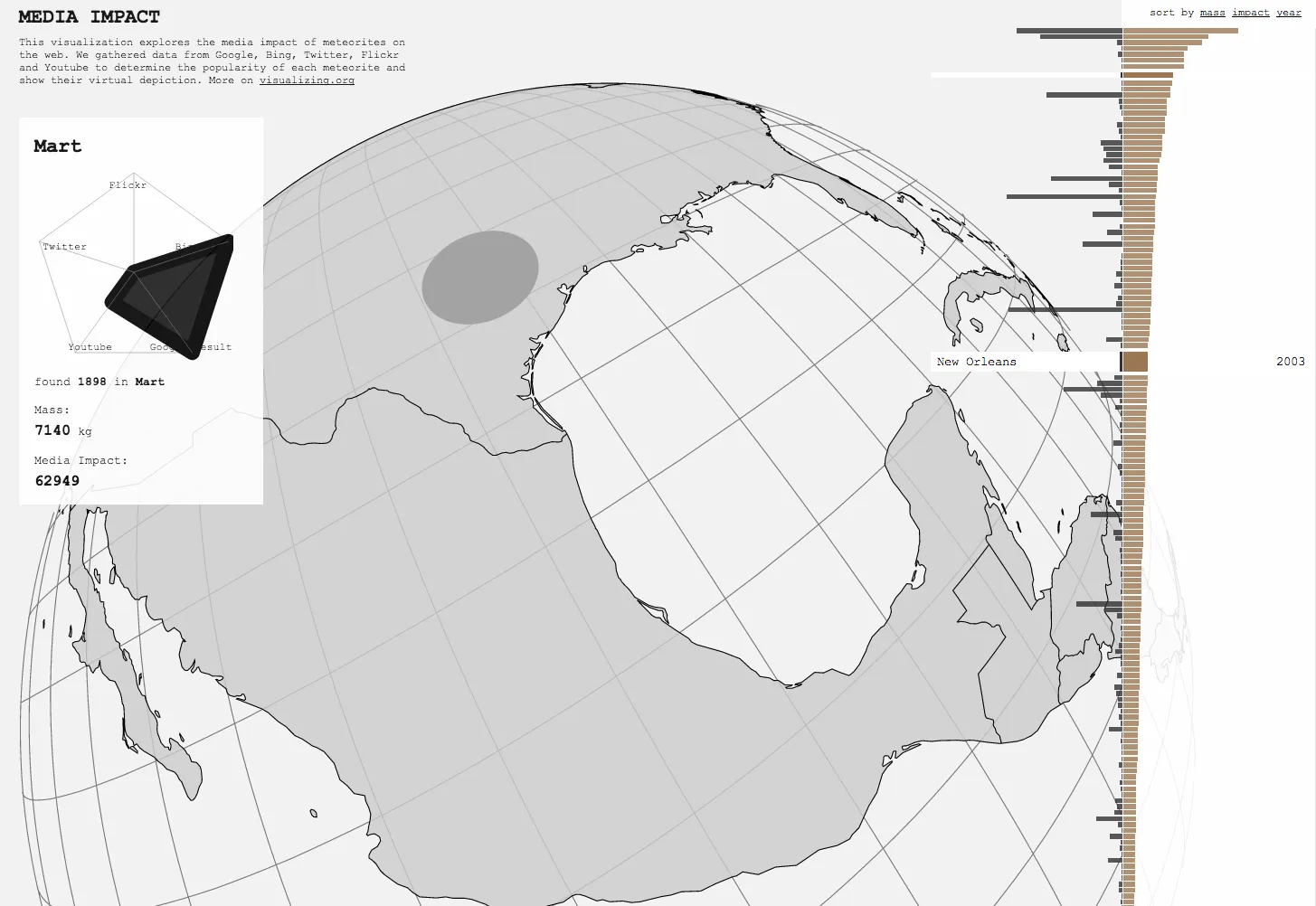
Selecting a meteorite shows the anatomy of its online impact — per-platform counts in a radar chart and, while the platforms’ 2013 APIs lasted, live tweets, Flickr photos and YouTube videos — and lets you hold the two craters side by side: physical mass on one axis, public attention on the other.
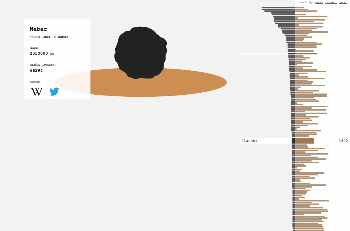
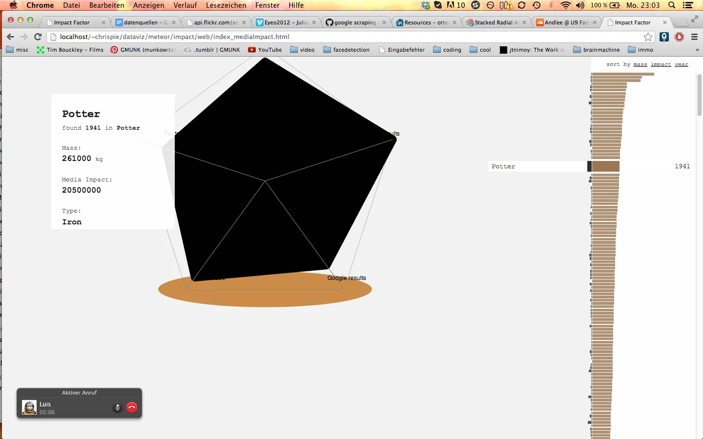
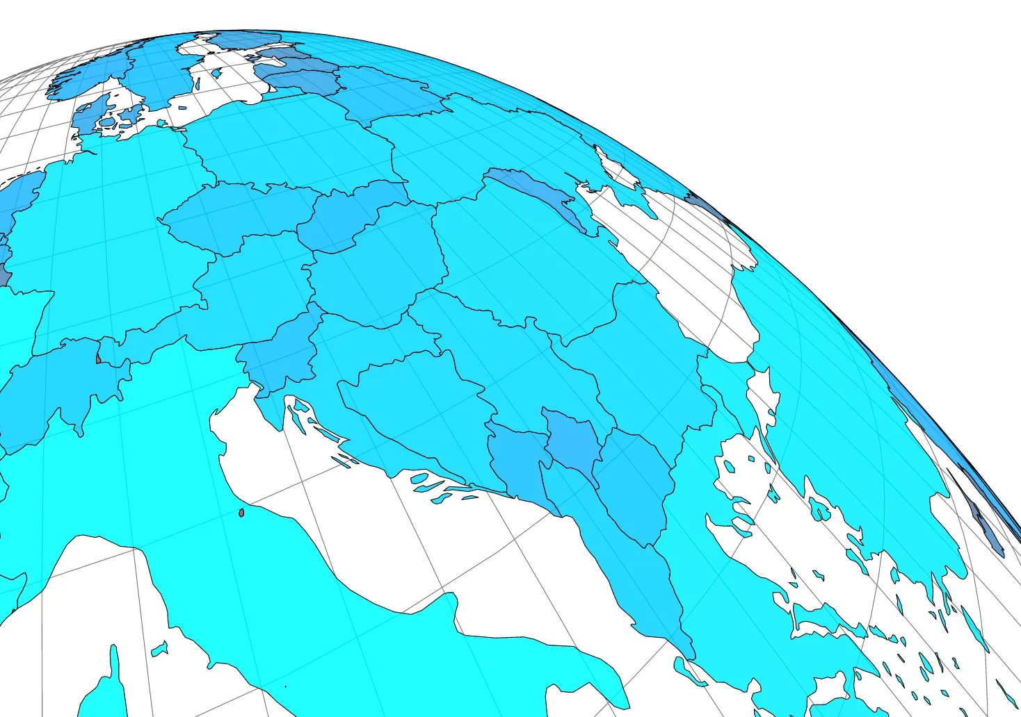
The scraping took longer than planned, which left little time for the visualization itself: it came together in a rush and grew in iterations as the contest deadline was pushed back several times. Early versions sat a black meteorite silhouette on its crater, or blew the radar chart up into the meteorite itself, before the chart moved into the info card and the crater onto the globe. Aesthetics came first, which is why the satellite projection in the background doesn’t always help you locate a strike. An impact animation on the map, with particles standing in for the media items, stayed on the wish list. As always, the process is the outcome.
Built with Luis Grass in the FH Potsdam course “Dataviz Challenges” (summer 2013, supervised by Marcus Paeschke), as an entry to visualizing.org’s Visualizing Meteorites challenge; the code is on GitHub (CC BY-NC 4.0) and some process screenshots are on Flickr. In the same course I also made Code RED DNA.
Images
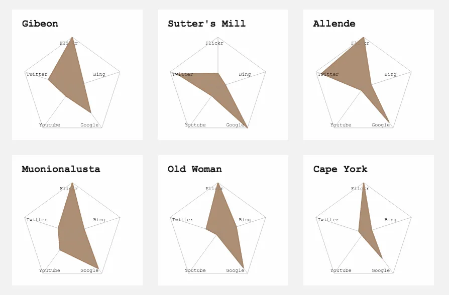
Radar small multiples
Left and right arrow keys flip through the pile, Enter enlarges the top image.