NZZ Wandelhalle
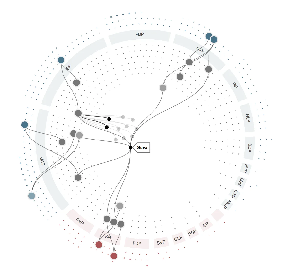
For my latest project, I had the pleasure of creating a data visualization on lobbyism for the Swiss newspaper NZZ (full article) in collaboration with Lorenz Matzat and Sylke Grunewald. The result is “Wandelhalle”, a playful and intuitive interface that explores the true interests of lobbyists.
The Visual Language
To create “Wandelhalle”, I used d3.js, a powerful data visualization library. Inspired by the work of Mike Bostock and his code snippets, I started the visualization in a radial manner, but then redefined and reinterpreted the visual language. The final result is a dynamic and interactive visualization that allows users to explore the data in a fun and engaging way.
The Creative Learning Process
Creating “Wandelhalle” was a journey of discovery and experimentation. I learned a lot about data aggregation, handling, and visualization along the way. The project went through many iterations, each one building upon the last. And with each iteration, I pushed myself to try new things and explore different approaches.
The Potential of Visualization
One of the most exciting things about “Wandelhalle” is that it has the potential to go even further. For example, I experimented with transformation the visualization into a different graph view, which showed me that there is still room for growth and exploration in this area.
Conclusion
Overall, I am extremely proud of “Wandelhalle”. It represents a significant step forward in my career as a data visualization expert, and I hope that it will inspire others to explore the possibilities of data visualization as well. If you are interested in seeing more of my work, please feel free to browse through my Flickr stream, where I have documented my visual process in detail.
Credits
- Client: OpenDataCity (Lorenz Matzat), NZZ (Sylke Grunewald)
- Code: GitHub
- Prototypes: process